Designing Your Heath Tile Installation
Before choosing your tile, consider these guidelines to select the right color, pattern, and feel for your project.
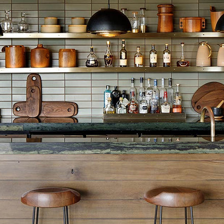
Scale
Scale the tile for the space. You can use a large tile for a small space to make a statement, but it’s often safer to choose a smaller tile.
Try not to mix tile sizes and shapes. Generally it’s safer to keep to a consistent tile size, although we’ve also seen it work when mixing sizes is part of the design intent and works well with the context.
Tile should work with the light in the room under multiple conditions. Like anything else, the texture and color of the tile should be chosen with an eye to the quality of light in the room—how much there is, and if there’s a cast to it—and the type of mood you’re after.
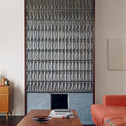
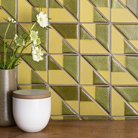
Pattern and Variation
Make sure there’s a clear focal point for the installation and that everyone (the homeowner, designer, contractor, installer) agree on where that is. A strong focal point will honor the overall design of the room, not just for the tiled surface. Use variation and pattern to bring the focus to where you want it, not away.
Make sure any pattern has enough space to repeat. This provides the greatest impact.
Consider the distance from which you’ll see it. If you’ll mostly be seeing the tile up-close, it pays to be extra-precise in layout, and the way in which things like corners come together. If it’s an accent wall you’ll see from far away, the emphasis moves to the overall look and effect.
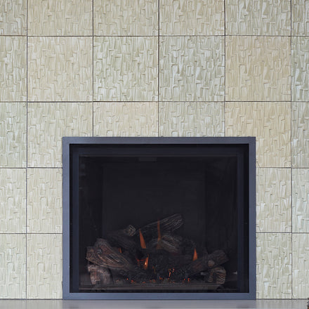
Even if you’re working with a single glaze, a higher variation glaze will work a lot like pattern. High variation tile will have less chance of blending well in a smaller space, so the variation differences will be more evident. If this is the desired effect, great. If not, it’s best to consider a lower variation tile. Buy extra tile (particularly if it’s overstock) to take account of variation.
Grout
Think of grout as one of your most vital design tools. Grout can emphasize or lessen the depth and variation of our tile, creating texture and dimension – or it creates a surface where the tile becomes the backdrop to the grouted pattern.
Create pattern: High contrast grout emphasizes individual shapes and creates a strong pattern, while a tonal grout color, is more subtle, and puts the attention on texture and relief. Similarly, a wide grout line will emphasize pattern, while a very thin line emphasizes color, variation, and dimension.
Create visual unity: For installations using multiple glazes, using the same color grout as the underlying clay body ties the pattern together nicely, creating a sense of cohesiveness and flow.
Emphasize key tones: Use a grout color to bring out a particular tone in glaze, particularly if there’s a great deal of variation in a glaze and you’re seeking to emphasize a particular tonal range.
Trim
For more traditional designs, this means using bullnose or or glazed edge tile that blends with the rest of the installation. Schluter generally works better in more modern installations. Unless the Schluter edging is going to be used as an accent, the color should blend as closely as possible with the tile. Painted wood trim the color of your walls can also be used (especially with more traditional homes).
Hire a Pro
We strongly recommend hiring a professional (and preferably one who’s worked with Heath tile before) to install your tile.
Looking for Something Else?
Planning an installation? Browse our Installation Guides.
Want to dive deeper into tile? Review our Technical Resource Library.
Have other tile questions? Read our Tile FAQ.
Ready to start an order? Contact a Tile Specialist for assistance.


Contact Us
Send us a note to let us know how we can help with your project.
We also have tile showrooms in Sausalito, Los Angeles, and San Francisco if you want to see the product firsthand.